Table of Contents:
- Create a Website Strategy
- Make Sure Your Site is Mobile-Friendly
- Make the Website ADA Compliant
- Improve your Website’s Loading Speed
- Optimize Images and Text for SEO
- Add More Calls to Action (CTAs)
- Add More Social Proof
- Audit Your Content Marketing Strategy
- Improve User Experience (UX) on Your Website
- Develop a Responsive Design for Multiple Devices
Looking to develop a coherent E-Commerce website that drives your business growth?
Introduction
If you’re going through a website redesign, it can be hard to know where to start. You might not have the resources or expertise to do it right. Or maybe you just don’t have time! Either way, the first step is often creating a strategy for your new website – and that’s what we’re here for.
There are many ways you can get this done real quick. WordPress offers several templates that you can simply pick and use them to redesign your website. WordPress development is comparatively quicker, user-friendly and dynamic but you can go with whichever development options that best suit your needs.
Website Redesign Checklist For Successful Transition
1. Create a Website Strategy

Having a website strategy is the first step to designing a successful website. It’s essential to think through your goals before you start designing, because it will help you determine what content and features are most important for your audience.
The most common types of strategies include:
- Content Strategy – This is all about making sure that your site has the right amount of information on it, in the right format, at the right time.
- Conversion Rate Optimization Strategy – A CRO strategy focuses on improving how visitors interact with each element on your page so they’re more likely to convert into leads or customers (or both).
- User Experience Design Strategy – UX design focuses on creating an enjoyable experience for users who visit your site–whether they’re checking out products or reading blog posts–so that they come back again and again!
2. Make Sure Your Site is Mobile-Friendly

If you don’t have a mobile-friendly website, then you’re missing out on a lot of potential traffic. A lot of people are accessing the internet via their phones and tablets these days. If your site isn’t optimized for those devices, then it’s not going to show up in search results as often as it should.
And if that doesn’t convince you that having a mobile-friendly website is important, here’s another reason: Google says that if your site doesn’t pass its Mobile Friendly Test (which tests whether or not your site works well on smartphones), then they’ll penalize it in their rankings system–and so will other major search engines like Bing and Yahoo!
To see whether or not your site passes this test, use this handy tool from Google itself! It takes less than 10 seconds and tells you exactly what needs fixing before we start talking about redesigning anything else…
3. Make the Website ADA Compliant

The Americans with Disabilities Act (ADA) is a federal law that requires businesses to make their premises accessible to people with disabilities. It also establishes guidelines for making websites, apps, and other digital products accessible.
The ADA applies to all public accommodations – including hotels; restaurants; theaters; stores; banks; museums; parks; zoos and amusement parks – as well as private entities like schools and universities. If your business has at least one employee who isn’t an owner or officer of the company (with no more than 50 employees), then it’s required under federal law that you comply with the ADA regulations by making sure all entrances are accessible by wheelchair users, providing braille signage in public restrooms if requested by customers who are visually impaired, installing ramps where required etc., etc..
If you’ve got any questions about how exactly this impacts your website redesign project feel free to reach out via email!
4. Improve your Website's Loading Speed
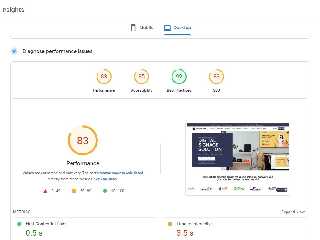
The best way to improve your website’s loading speed is to use a content delivery network (CDN). A CDN is a distributed network of servers that delivers web content to end users at the location closest to them.
A caching plugin will also help with improving your website’s loading speed by reducing the amount of data being sent and stored on each user’s computer, as well as speeding up page load times. The most popular caching plugins are W3 Total Cache and WP Rocket; however, there are other options available if you don’t want these two particular ones.
It’s important that you choose a fast server when hosting your new site; this means looking at different providers who offer high-performance hosting solutions.
5. Optimize Images and Text for SEO
Optimizing your images and text for SEO is a great way to help your website rank higher in search results.
Images should be relevant to the content they’re on, high quality, and optimized for mobile devices. This means that they should have a minimum resolution of 1920×1080 pixels (or 1200×800 if you’re using a responsive design). The image filename should also include keywords related to the page’s content–for example “dinosaur_in_a_parking_lot” instead of just “dinosaur.” Similarly with text: make sure it’s relevant, readable on all devices (iPad/iPhone users often need larger font sizes), and contains relevant keywords or phrases within sentence structure so that Google knows what each piece is about when it crawls through pages looking at links between them
6. Add More Calls to Action (CTAs)
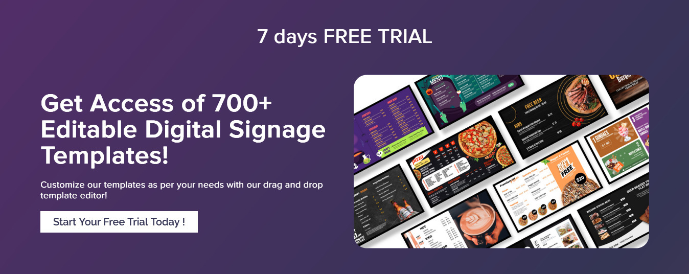
Call to actions (CTAs) are the buttons you see on websites that prompt visitors to take some kind of action. They’re usually placed in prominent positions on the page and can be used to encourage users to sign up for newsletters, buy products or services, download a guidebook or ebook, share content on social media, submit a contact form–the list goes on!
You don’t need many CTAs on your website but they should all have a clear purpose: if it isn’t obvious why someone should click it, remove it! You may also want to consider making some calls-to-action stand out more than others by using different colors or sizes than those surrounding them so they stand out even more in their environment (like how Facebook does with its “Sign Up” button).
7. Add More Social Proof
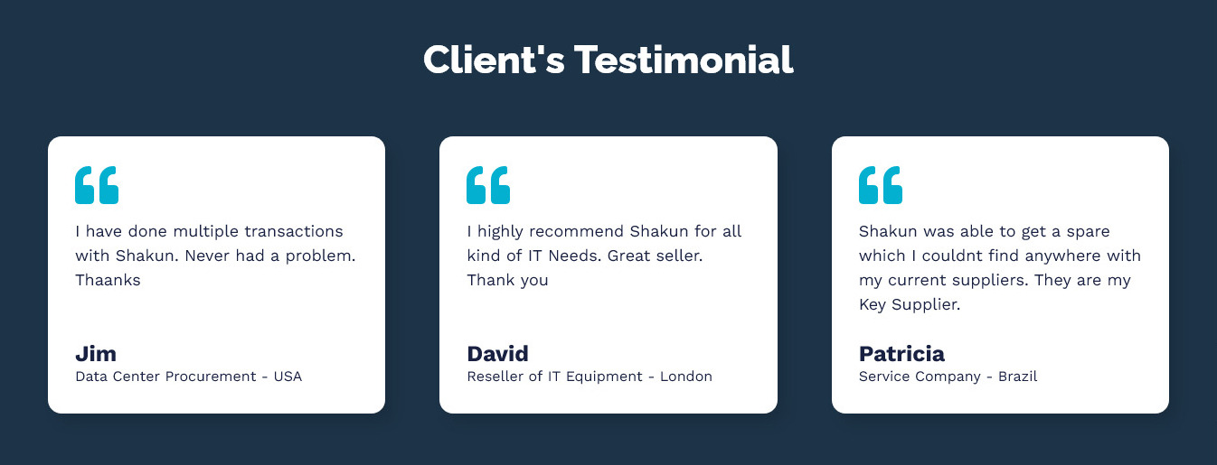
There’s nothing more persuasive than social proof. When you see that someone else has already bought your product, or even better, raved about it, you’re much more likely to make the same decision.
Social proof can take many forms: customer testimonials, case studies and even reviews from customers who have purchased your products. The key here is to use this opportunity wisely–the goal isn’t just getting more sales but building trust and credibility along the way as well!
8. Audit Your Content Marketing Strategy
Content marketing strategy is the backbone of your website, and it should be reviewed regularly. A content audit will help you determine whether your current strategy is working or if it needs to be tweaked in order for you to achieve your goals.
Auditing the content on your site can be done with simple steps. This audit should include an analysis of:
- Content – How much quality content do we have? Are there any gaps in our coverage? Is there enough variety in our topics? Does our writing style match with our target audience?
- Keywords – What keywords are we targeting? How many times do they appear on each page (and in which parts)? Where could we add more emphasis on certain keywords without overdoing it so that they don’t look spammy when someone searches them in Google (or Bing)?
- Backlinks – Where are these coming from and how strong are they relative to one another (e.,g., do most visitors come through organic search versus paid ads)?
9. Improve User Experience (UX) on Your Website
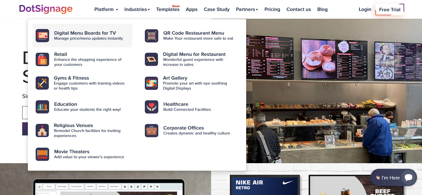
UX is a combination of usability, accessibility, and user satisfaction. It’s about how users feel when they use your site or app. The goal of UX design is to create an environment where users can easily navigate through your site.
The most common mistake that companies make when it comes to improving their website’s UX is thinking that they only need one big redesign every few years–and then all will be well again! We’re here to tell you: no matter how good your current design looks on paper (or even in reality), there are always ways for you as a business owner or manager to improve upon it by making small improvements over time instead of trying something drastic like a complete overhaul every few years.
10. Develop a Responsive Design for Multiple Devices

Let’s be honest: you don’t have time to make sure your website looks good on every device. Luckily, there are ways to make sure your site works well across all platforms.
- Use responsive design. A responsive design is one that adapts its layout based on the size of the browser window or device being used by the user (as opposed to a static site that always looks the same). This means if someone is using your website on their phone or tablet, they’ll see something different than if they were using it on their desktop computer.
- Optimize for mobile devices first and foremost! It might seem obvious that you’d want your site designed with mobile users in mind; but many companies overlook this crucial step because they’re too focused on creating an attractive desktop experience first–and then figure out how those elements will translate when viewed on smaller screens later down the line when designing their websites’ front-end code base.*
Looking to develop a coherent E-Commerce website that drives your business growth?
Conclusion
By now, you know the importance of a well-written website. But there’s so much more to consider when transitioning from legacy to a new site. We hope this checklist has helped you think about all the steps that need to happen in order for your company’s website to succeed. If at any point along the way something seems overwhelming or out of reach, remember—the best thing about building an awesome website is that it can be done one step at a time!
If you are looking to redesign your website, then Zorior is a perfect match for your needs. Our team of designers are creative, understand the importance of user experience (UX) and user interface (UI). We can help you with a quick turnaround and amazing results. Drop in your inquiry at info@zorior.com.
